About Us

Showing posts with label Production Design Review. Show all posts

Wednesday, 19 October 2016

Beauty and the Beast Production Design Review

Production design in animation is a unique art form. Disney's Beauty and the Beast, directed by Gary Trousdale and Kirk Wise, takes the environments the story takes place in and uses objects and architecture design in ways live action productions are not able to. Animating a film allows the production design team to create unique spaces and link them to the characters and their story arc. The sets are also in sharp focus, allowing the audience to see every detail. The Beauty and the Beast was also one of the first animated films to have a production design team, which is pretty cool! I find it interesting that maybe production design wasn't considered as important in the past for animated films, maybe, or it was just assumed that the animators would have that as part of their job description?


The animation for the time the film was made is incredible, the quality was great especially when you consider that everything was hand drawn. Knowing that the production design team would have had to coordinate with the animators in order to get the best look possible, and the one the production design team had in mind initially. Both of these teams working together for a common goal is pretty impressive, especially when you remember that this was one of the first animated films to have a production design team in the same way live action films do.


The Beauty and the Beast was also hand-animated, which requires a crazy amount of precision and focus. These teams were working together to make something they could be proud of, and I think that's pretty admirable.

Georgia x

Friday, 14 October 2016

Hairspray Production Design Review

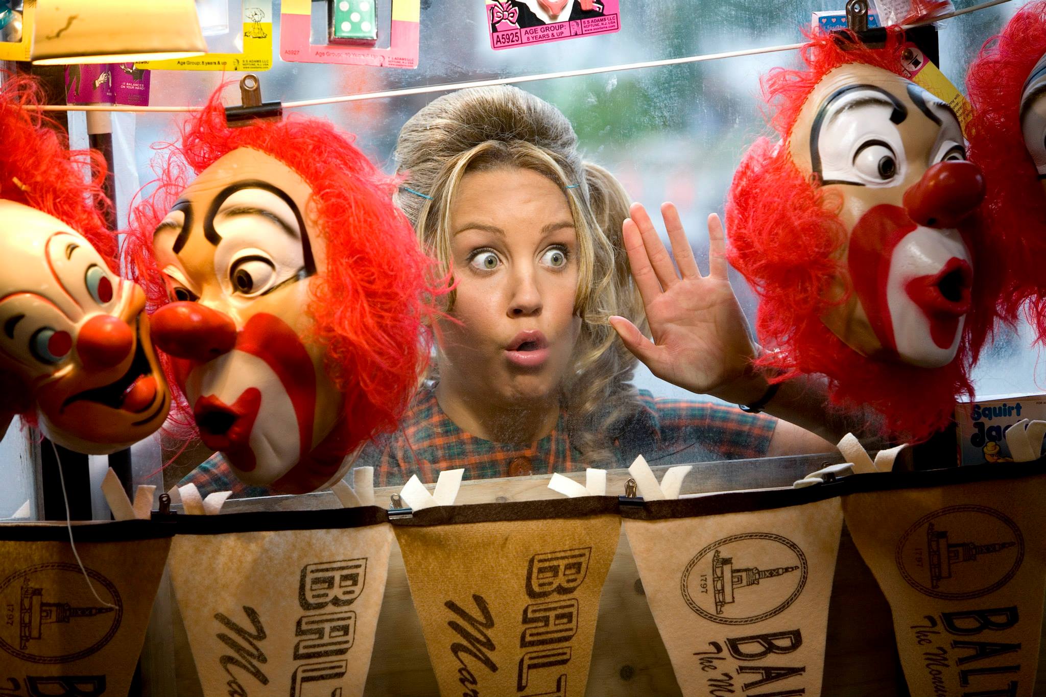
Adam Shankman’s 2007 remake of Hairspray leaves you feeling happy, upbeat and ready to sing and dance for hours. Compared to John Waters’ 1988 film, Shankman’s feels more heightened in a way, especially with production design and costuming. The difference between the classes, or between Tracy and the people on the Corny Collins Show feels bigger. The colour and sound of the Corny Collins set are big and bright, larger than life. Of course, it’s quite obvious that this is because of the set not being real life, but the cast members of the show take on this air (Amber in particular) and even in their clothes, they don’t seem to fit into their ordinary school lives before they rush off to dance on the show. This only makes their status higher, and when Tracy attempts to audition for the show it’s obvious even from her clothes that being accepted in this elite group only happens when you’re very fortunate.

Tracy’s home is also quite dull in regards to colour – it feels normal, ordinary and familiar. The school does too, with colours and furniture that would be found in a typical high school. Colour is a big thing here – the brighter and bolder the colour, the more people in the story are drawn to the people in these environments. People feel compelled to look towards the people and places that seem better than their own lives. Production designer David Gropman and costume designer


Rita Ryack have worked together brilliantly on this film, the costumes fit the environment the sets create perfectly, as well as expressing the time period.
When Tracy is accepted into the show and starts to be accepted by the cast members (apart from Amber), she also receives an invitation for sponsorship. This results in new clothes for both her and her mother, making her feel better and more a part of the group, and elevating her to the status of the rest of the group.


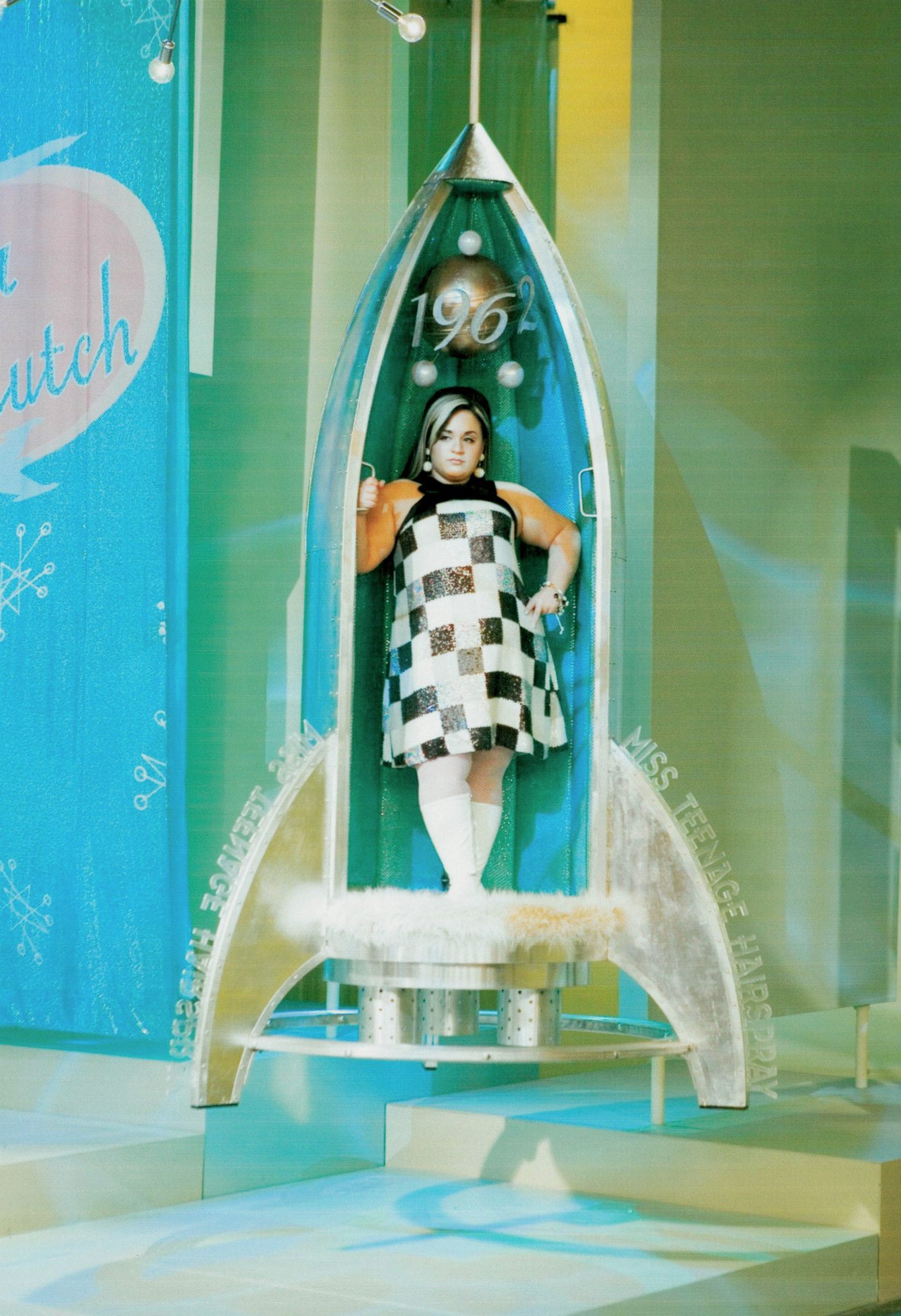
At the end of the film, the Miss Teenage Hairspray pageant serves as the set for the showdown between Tracy and Amber, and the family and friends that have been pulled into the whole event. Bright, sparkly and full of life, the aerosol-filled show looks perfect for the stereotypical look we think of when the 1960s are mentioned.


Georgia x

Friday, 7 October 2016

The Breakfast Club Production Design Review

John Hughes’ The Breakfast Club’s setting is so perfect, it can’t be improved. The majority of the film is set in Shermer High School in Chicago and was filmed in North High School in Des Plaines, Illinois. It looks so normal that it could be anyone’s high school, fitting in with the whole idea of the events of the film being a part of an experience. Anyone that has seen the film, especially while they were in school, would consider this as a part of their own high school experience because the characters are so easy to identify with and identify as people they would know. John W. Corso’s setting is so perfect that it feels both timeless and so completely 80s all at once.


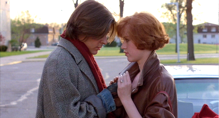
The props and costumes express the character’s personalities expertly, and the costume designer Marilyn Vance has thought through each character’s experiences in order to create their look. Each character gets one costume as the film takes place over one day, with each piece of clothing creating a layer that recognises a little part of their personality. As the characters start to get to know each other and let their guards down they start to take off some of the layers, effectively taking away aspects of their look or personality they have constructed as a barrier to other people.


At the end of the film one of Claire’s earrings is given to Bender, and Allison takes a patch from Andrew’s jacket, showing that each member of the group aren’t really that different at all. These moments of recognition and solidarity show that they will remember their time together and their similarities. The set pulls them together into this one group, and although they seem to be different at first their shared surroundings unite them.


Georgia x

Friday, 30 September 2016

The Notebook Production Design Review


Director Nick Cassavetes’ 2004 film adaption of the 1996 Nicholas Sparks novel The Notebook is a story well known by many a film watcher, and many a human being.  Rachel McAdams and Ryan Gosling portray a young couple in the 1940s, successful in keeping their relationship surviving despite many a hardship and trial. 

The Notebook

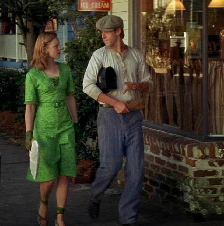
Allie’s seemingly normal upbringing of wealth and prosperity is put into perspective when compared to Noah’s upbringing, and this is quite effectively shown through the costuming and set design. Although the film exists in more of a ‘rose-tinted glasses’ type world, the costumes ground the film in a sort of reality even though they are not what most people would have been wearing at the time due to the war effort.

Allie’s costumes are particularly red, with brighter colours and patterns compared to the generally darker and plainer colours Noah wears, emphasising the disparity in wealth that separate the couple, just one obstacle that they need to face in their relationship. Just by looking at photos of the couple together it is easy to see the difference between them, proving that the efforts of costume designer Karyn Wagner have paid off. All of this helps the viewer to understand the characters and some of their backgrounds without perhaps realising it.

Georgia x


Friday, 23 September 2016

Avatar Production Design Review

James Cameron’s 2009 film Avatar boasts some incredible production design, and has been recognised in many awards ceremonies. The production design team of Rick Carter, Robert Stromberg and Kim Sinclair took out Best Production Design at the 2010 Academy Awards, the 2010 British Academy Awards and the 2010 Saturn Awards, as well as being nominated for the same award at the Society of Film Critics awards in 2010.


Carter has talked about the sets he created, and the glowing night world that is depicted on screen has been influ
enced by what he had actually seen at the bottom of the ocean while working on Titanic. Pandora, the jungle world in Avatar, has a dreamy quality, especially at night time. The incredibly images allow audiences to suspend their disbelief of a world very different from our own, and are immersed in the film’s story world.
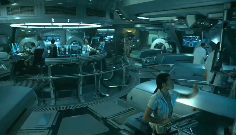
Carter creates work that intends to make the viewer almost believe they are in the world. He has said that he strives to make sets or looks that draw the viewer into the film and the film world, and that if someone is questioning how they have made something or how a certain effect has been achieved then he hasn’t done his job. His work on Avatar is certainly an example of this, with the sets drawing people into the world and working in sync with the script, the actors, sound, cinematography and other departments to create an environment that feels real although it is so different from the one we know.

The 3D technology and image quality bring out the incredible sets, along with the visual effects that bring the characters to life. Cameron’s initial script included examples of the environment he saw, giving Carter and his team images of purple moss reacting to pressure, rings of green light and an overall dreamlike quality and beauty that served as a starting point. No matter what environment the design team created, they created smaller and bigger details to give the spaces a feel of being grounded in reality. The dramatically different sets and locations make this film feel grounded while exploring ideas and places distinctly different from each other and our own reality. This film is certainly one to see for the production design alone.


Georgia x